Don’t forget performance. How not to redesign a website

We’ve all heard the expression that beauty is only skin deep—and believe it or not, this can be applied to website design. When a big brand unveils a flashy new homepage, it might look great, but what about its performance and end-user experience? Have they been overlooked in favour of a more complicated page design?
Don’t forget performance: how not to redesign a website
Recently, a world-leading brand revealed a new homepage with much slower loading, longer “Time to Interactive” and “Visually Complete” times than before. Given what we know about how users access websites (increasingly on their mobile, for example) and the impact of slow performance on high bounce rates, it’s astonishing that such a large business would launch a new site without identifying and fixing these performance issues.
To use this as a learning exercise, we’ve broken down some of the before and after statistics of the website in question to emphasise the impact that the new homepage design has on user experience when compared to the old page:
- The homepage size has increased from 1.1 MB (1.9 MB uncompressed) up to 4.2 MB (18 MB uncompressed), meaning that the size of the page download has increased a lot.
- The website’ s Google LightHouse Performance Score, which is a globally recognised and respected internet performance metric, dropped from 100 down to 36.
- The Time to Interactive, the critical (for mobile) time it takes for a user to be able to interact or click on the page, has increased from 1.1 seconds to 10.48 seconds.
- The total number of requests that the user’s browser makes and receives to complete loading the page has risen from 55 to 360.

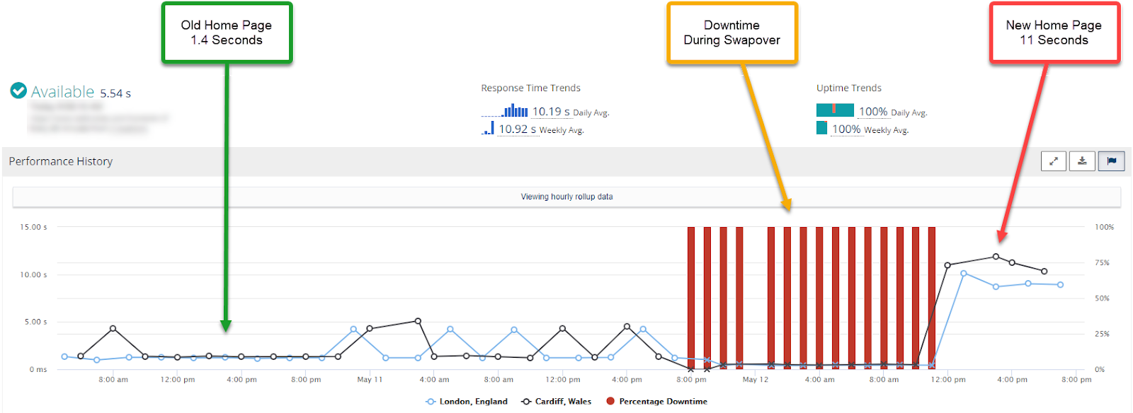
Rigor performance graph (blue line) showing download time for the old homepage (10-11 May 2020) vs. the new homepage (from 4pm on 12 May 2020)
Although the new homepage is better optimised (i.e. 18 MB compressed down to 4.2 MB) and actually has a faster “Time to First Byte”, this isn’t appreciated by the end-user; this is because the design, composition and the content of the homepage are so poorly conceived that the UX of the website is effectively ten times worse and 8.5 times slower.
From an SEO perspective, the new website is so much slower that Google will penalise it. This means they will have to work much harder and spend considerably more to get and maintain a decent SEO ranking, which their old homepage would have achieved itself (organically).
In short, from a performance, SEO and UX standpoint, this is a case study of how not to design a website.
How could this have been avoided?
During the development of a new website, a performance gateway should have been used to pinpoint any performance issues and, if they are bad enough to fail a performance SLA, stop the build from going live. Having identified slow performance, this should have led to a redesign to ensure that the end-user experience wasn’t compromised. This is why website performance assurance is a crucial step to testing any website design before release.
As it stands, it’s very likely that this particular website will result in a loss of business from customers (customer bounce rates will increase due to the longer page download times—this should be kept between 2-3 seconds for a standard homepage) and will also negatively impact the business’s market share (due to decreased SEO rating linked to poor performance).
In addition to this, their hosting and bandwidth costs will probably increase.
How Rigor could help
Using Rigor’s website performance optimisation recommendations, businesses can use data to make smart, strategic improvements to their website, allowing them to ensure that end-users are experiencing a webpage without slow performance or errors.
In this instance, Rigor’s optimisation tools could provide invaluable insight into performance issues, such as those we’ve identified above. With a deeper analysis, we suspect the result would be a complete redesign (which, again, could have been avoided with a proper performance gateway during development!).
The moral of the story
Throughout the development of any website, it’s important that performance is assessed and assured by running tests automatically at each stage. Tools like Rigor can ensure that your website is running without any issues and is fully optimised to guarantee positive end-user experience.
If you want to try out Rigor for yourself, start a free trial now. Or if you’d like to talk to us first and see a demo, we’d love to hear from you.

